Thursday 29 March 2018

Finished Trailer and Ancillaries

I have now completed all three elements of my A2 media coursework:

Trailer


Poster

Magazine


Wednesday 28 March 2018

Drafting and Planning : Final changes to trailer

Before handing in the final draft of my trailer, I wanted to make a few more changes which were suggested by my target audience. Firstly, I need to add credits at the end of the trailer which is something i remembered as a primary convention of a trailer. Second was to mess around with sound to see if the final few scenes will flow better sound wise.


As it is conventional I have now added the final credits to the trailer. Firstly, this will give my trailer a realistic look and I wrote the date which I had specified on the film poster so that all of the products shared the same information. As well as this, I placed the hashtag #EnterTheCloud at the bottom of the second  intertitle, as many film trailers and advertisements now do this so that audiences can talk about the film via social media. This is a clever way of marketing the film through word of mouth, and it is also completely free.


However this had extended my trailer quite a bit From 2:33 to 2:40 which isn't really conventional but there have been some film trailers like the justice league which had a 3 minute trailer so its not necessarily a problem and we could blame the extended time on film logos etc. 


I decided to make the voice at the end of the trailer work better, due the the target audience feeling it is out of place, i decided to slow down the voice by 1/10 of its original speed this made it go deeper and suited the Stephen's Antagonist better by making him have a deep and sinister voice. 

Altogether I used around 14 seconds of copyrighted music:

- Can't go on without you - By Kaleo during the fight scene at the end 


With these changes, I have now finished my trailer as well as my ancillary products!!


Monday 26 March 2018

Drafting and Planning: Magazine Development and final changes.


This was the state that i left my magazine in since last time I blogged about it. since then i have made some changes to the cover-lines of my magazine. Ready Player One Comes out in March and therefore wouldn't have a place, as a cover line, in an April issue of Empire. Therefore i have removed it and replaced it with 'Rampage'. Originally i was going to include Infinity war but then I released it is too big of a film that it would just be a cover-line and not a front cover and I already have two Marvel films as my other cover lines and a third wouldn't look realistic. There for i have gone with rampage as it is a big film that isn't Marvel related.

  • This is the photo I used for magazine. I decided to cut this photo out of its background so i could place it on my magazine without the background and cover the Empire Logo which is common with any movie magazine. 
  • I also decided to add an effect on the masthead and the main image. It made them appear as if they had a shadow round them, which made them look more professional and realistic. 

Here we see the new cover line and the image which i have edited to have a shadow to make it look realistic. i have added a grey background to the magazine suggesting the dystopian world and the tone of the film. I have also added more conventions: 

  • A puff which is meant to give the audience a special offer or section of the magazine which is made to be attractive on its own to draw the reader to that if they are not intrigued by the main image. 

  • A date and price in the M of EMPIRE logo which is something they do a lot of. this informs the reader what issue they are buying and the price. I placed the price at £4.50 which is the cost of this magazine but it has changed over the years. 

  • A bar code which gives a realistic feel to the magazine and makes it look professional. 

  • Main cover- line which links directly to the main image. it utilises a typography that is used in my trailer and poster giving a direct link to the dystopian world. ''Adam Tooley On Surviving In The Wasteland'' Is written underneath to give the readers an insight to what the article is about. It implies and interview

  • A plug is used at the bottom to show what else is inside the magazine apart from the main cover film

Total Conventions 
  • Main Image 
  • Main Cover line 
  • Masthead 
  • Date 
  • Price 
  • Bar code 
  • Cover lines 
  • Puff
  • Skyline (Talked about in previous blog post in earlier stages) 
  • Plug

This cover meets all of the codes and conventions of film magazines that I looked into, specifically Empire magazine itself.  Whilst looking realistic and professional, it also conveys the tone of the film through colour and facial expression. I am also happy with this ancillary product!

Sunday 25 March 2018

Drafting and planning : Poster development and final changes


Poster Photos


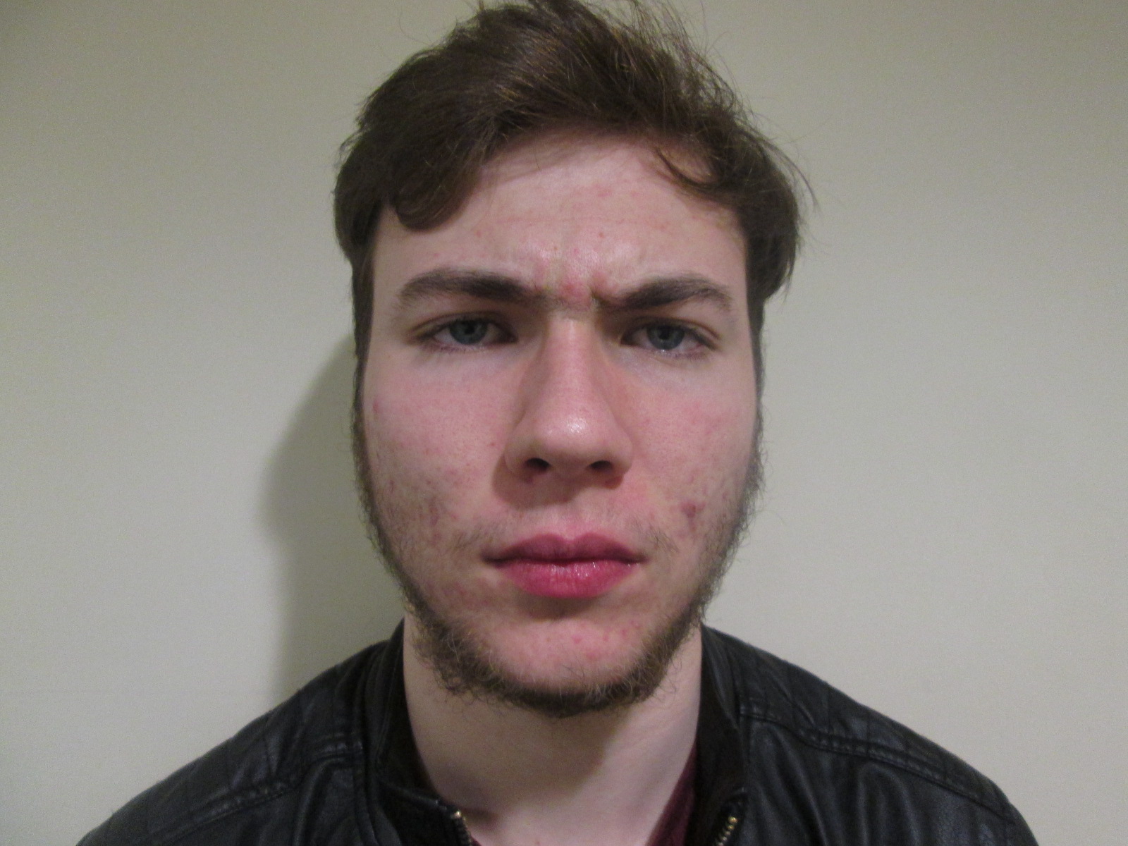
These are the photos I took to use for my poster, however I am not going to put them into my poster like this. I have used page plus to edit these photos to make them look like my desired way. From my research i desire to create a poster where the two faces are split in two and but together in the centre of the poster. However, i do not intend for them to meet in the making of the poster as this may give the audience the wrong idea and make them think they are allied with one another when this is not the case. the gap between them will symbolise them as being different from one another and polar opposites. When i edited these photos in page plus i thought this actually looked better.
I have already completed most of my poster, bar the photographs. I made sure I looked back at research to ensure i made it look as professional and realistic as possible and included all the conventions you would expect to find on a poster.

 
- The tagline at the top of the page is a convention used to sell the film from the poster and it and opportunity for the films creator to make the film memorable to the audience. For mine I used 'Hunt Before You're Hunted' as i think this is easily remembered as it uses a play on two words very similar. The typography also draws the audience's attention due to its typography as it appearance looks as if it had been vandalised by someone living within my film. This makes it stand out.


- I have added the actor's names at the top of the poster. This is also a major convention for a poster as this may also draw audience's in as well known actors may have a large fan base which will increase the viewing of the film. Actors can also have titles such as 'Academy Award Winner' or 'Golden Globe Winner' which is another way of reeling in audience members as they will see this as an Oscar worthy film and that the acting will be up to that level. I haven't included this on my poster as this is not a necessity and doesn't appear on all poster.


-  The most necessary convention is the title of the film is the title of the film. At the end of the day the audience is going to need to remember the title of the film therefore it needs to be the largest piece of text on the poster so it stands out and the name itself shouldn't easily stick in the minds of the audience. This is why i changed my title from ' Underneath The Mushroom Cloud' to 'Under The Cloud' as it was shorter and not too wordy. I have also used a typography that makes the words look like they are decaying and bits of debris is coming off them whilst still being able to be read.
- At the bottom of the poster I have incorporated the use of poster credits. This still gives recognition to the creators, actors and directors etc and it is rare to find a poster without them. However, it can happen. The steel tongs font is the font used for all posters and i downloaded this to make my poster look professional as possible.


- I have also included a date at the bottom so audience know when the film is being released. This creates anticipation and excitment for the film. 

Photo Editing 

I decided to crop the images half way and darken them to fit in with the colour scheme of the poster. I also rubbed out the top and bottom of the image so they fit in better with the background and look more professional. Sample below:

I have done the exact same for the other side of the poster 
Final poster 

During the process of mounting my photos on my poster i noticed some missing conventions. This was a Hashtag and a Website.

Hashtag is a form of marketing as people who use this hashtag are essentially spreading the word about the film without costing the production company a penny. Due to technological advancements and social media a film can reach millions through a hashtag. I have used the Hashtag #ENTERTHECLOUD which is a play on the title, form of direct address and teases the audience to see what happens if they go and 'ENTERTHECLOUD'.

The website allows audience's to look for more information about the film by giving them a website to look at.

  I have included the main image(s) of the characters and the film title which I placed on the poster first as I recognised how important they were for the audience to see. I then included the release date of the film at the bottom along with the credits and hashtag and website. The actors names and tagline are placed near the top of the poster, and there is a clear house style. I am very happy with my poster overall!


Saturday 24 March 2018

research into target audience: Poster tagline typography choice

When I began constructing my poster I had successfully chosen a tagline, through the use of a messenger survey. From the survey I was told that the audience preferred 'Hunt Before Your Hunted'. This was useful for me as it meant that I now had an effective tagline which would help audiences remember my product and film. However I also explored Typography and found two fonts that I liked the most. If you want to see the poster with the typography again this link will take you to the blog post: https://adamtoo13.blogspot.co.uk/2018/03/drafting-and-planningorganisation.html

I sent the two posters to a group to see which on they felt was better. This was the response:
Font 1 = PIO
Font 2 = Jangly walk


The overall feedback was that the second font, PIO was too messy and didn't really go with the post apocalyptic setting as good as the Jangly walk font. I would like to add a personal note that i felt  that jangly font was better to begin with and better emphasised the graffiti hand written tagline for the apocalyptic era.  

The poster looks like this with the Jangly font. 


Sunday 18 March 2018

Research into Target Audience: Trailer Feedback

Today I thought that I would show a few of my friends the trailer at its current state. Personally. I am quite happy with where it is at now and I think that after making several small changes I will have my final draft. I have used Instagram again and asked the people who I showed the trailer to (who would fit into my target audience) whether they enjoyed the trailer and if there were any possible improvements.


Overall they seemed to really enjoy the trailer which I am very happy about and my dystopian world has come across well, better then i thought it would.  There were some small improvements that  could be made before the trailer is finished...

  • Making sure all of the sound levels are equal, as occasionally the dialogue could not be heard which i think was the problem with Louis as he felt it didn't work enough or felt it didn't have enough of an impact on the audience. whilst the background music was too loud or vice versa. I will make sure this is corrected for the final draft I hand in.
  • A personal thing is that there are no credits at the end of the trailer which I need to do before i hand in the final piece


Apart from this, I am almost finished with my trailer and just need to finish the ancillary products I am in the middle of creating and the project will be complete! I am currently very happy with how everything is turning out.

Saturday 17 March 2018

Organisation : Sound

Sound is an important aspect of a film trailer and as seen in my first draft i have included a wide variety of sound as mise-en-scene is necessary for a film to be successful in any case.
But now that I have filmed more of my final piece I have place more sound within my trailer. Much of the sound files that were in my first draft were from the media files at school however these were just basic sounds, therefore if more complex sounds were needed then I needed to search for them which I have done. The sounds below are ones that are free and what appeared in my latest draft of my trailer

Fast Paced Action Sequence 0:10 - 0:17
https://www.youtube.com/watch?v=G766AEcXF6c&t=67s

Action Movie Sound Effect 0:27 - 0:53
https://www.youtube.com/watch?v=gJmHvTr8n9s&t=35s

Heartbeat from 1:02 - 1:38
https://www.youtube.com/watch?v=7Y33tZThdzg

Gun shot 1:38 and 2:13
https://www.youtube.com/watch?v=iKmaMjesWQc

Action sound effects for atmosphere 1:39 - 2:04
https://www.youtube.com/watch?v=Q71wWof5lhk

Monster sound 2:32 - 2:35
https://www.youtube.com/watch?v=jzDMlxV7Y9k

Some of these give permission for the users to use them in any of their projects but others i have had to ask for permission in the comments section.


Although some did not reply i will still use them anyway for my project


Friday 16 March 2018

Drafting and planning: improved trailer

From receiving feedback from my peers and tutor I have now created an all improved trailer which i feel is near the standard at which i want to submit it. As of now i have added the intetiles which were showcased in a previous post
https://adamtoo13.blogspot.co.uk/2018/03/organisation-intertitles.html


I have also added all of my footage that i have shot but I have cut some things from the first draft out. for example the ending before the title had a bandit running towards the camera but now it is the main protagonists pointing their guns towards the camera


Saturday 10 March 2018

Organisation : photography for Ancillaries

The final deadline for my coursework is vastly approaching. At the moment I feel secure and very confident that I will meet the deadline. However for me to be successful in my ancillary projects I must have a main image for my poster and magazine cover. So far I have started to apply the conventions to both of my ancillaries yet I am lacking photos. Therefore I have taken a series of photos that I will use for my ancillaries.

Poster:


These are the photos I intend to use for my poster. From my research and planning I intend to cut the photos down the middle to create a sense of a standoff between the two characters. Although Stephen ( Top Photo) doesn't appear in the trailer his voice is heard towards the end of it as the main antagonist therefore this is the reason he is on the poster.Some of the inspiration for this below:


Magazine


After doing my magazine survey it was suggested that I just have the main character on the magazine by themselves. Although i did like the other magazines i feel like this one worked well as it utilises direct address which main images of magazine covers do a lot to draw in consumers. I have used a light background so it is easy for me to cut out my cover star easily, including the poster. Overall I am happy with the photos I have taken.  

Friday 9 March 2018

Organisation: Intertitles

An inter title is printed dialogue or narration that is shown between scenes in a film trailer or silent film.  dialogue intertitles can be used to convey character dialogue or narrative intertitles or expository intertitles can be used to provide related descriptive or narrative material.

Primarily i will be using expository intertitles here are a few examples: 


In my feedback it was suggested that i use intertitles in my trailer to help the audience have a deeper understanding of what is going on in the trailer. These intertitles i have created are influenced by 
The Road's intertitles highlighting themes of desperation and survival and only having one word on a few of them. The intertitles appearing in my trailer appear below:  

As suggested by my teacher I have decided to put this inter-title at the beginning of my trailer as he believed that this would be a good place to put it and may draw audience's in if they know that the film is being made by another famous film. For the purpose of this inter-title i have made up a fictional film called Chinatown. 


The next three inserts can give extra context to the film and emphasise the type of film that is being portrayed in this trailer. They add a deeper understanding for audiences and are like guidelines for the post apocalyptic setting of the film. It also adds suspense as audiences would be unaware of what they are to 'Hide' from for example. 

This gives audiences a clear general idea of when the film will be released and allows them to build anticipation for when the release of the film. 

This once again emphasises the post apocalyptic setting. This also has a double meaning as it suggests that the films setting is at the end of the world in terms of location but also the literal end of the world. 


These two intertitles both suggest the action genre to the audience and are giving a choice to the audience


The Title of the film appears in much bigger size so it stands out to the audience more and so it lasts with them so they remember the film

I designed my intertitles with a black background and with red lettering to make the text stand out. it also links with the colour scheme of my magazine also creating continuity of themes across products  Because i added in these inter titles i was able to remove of some dialogue as i felt that these inter-titles did the job in explaining the movie and creating anticipation and excitment around the movie in less the time then a clip would. 
All of these inter-titles i believe perfectly fit in with my trailer and my film overall